A structure is nothing but spotting higher high, higher low, lower high, and lower low on any given chart to understand the trend and to know the context on the left side of the chart as to what a stock has been doing. To understand very well let’s take Banknifty daily chart which shows the structure for 1 year.
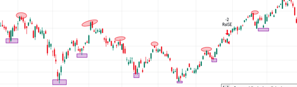
In this image, I have marked the pivot high as a red circle/oval and the pivot low as a pink rectangle to understand very well. Look at how simple it is to spot HH, HL, LH, and LL. This helps you to understand the trend and the direction of the specific index movement.
you may be asking how many candles/bars are good enough to understand the structure.
While every individual has a different way to interpret the chart in his context but I prefer to have around 200 240 candles visible on the chart to get a clear picture but you may go with what you are comfortable with. Lets me make it simple for you to better understand.
If you are trading 15 mint chart then 1 day will have 25 candles so to see 200 candles, you need 8 days of data on the chart to get a clear view.
So make a set chart as per your needs so that you get a good view of the structure and trend.
Now I will discuss support and resistance so get ready!
Support and resistance
Now I add the same bank nifty chart but instead of using circles and rectangles, I am using simple horizontal lines to mark support and resistance. You may notice spikes and gaps in certain areas. These horizontal lines are good enough to spot areas of support and resistance.

But many times the price either makes spikes up the resistance or leaves a gap in the support line which leaves you surprised as to what happened. Sometimes price moves in your trade direction after taking your SL. Why does that happen?
The reason is simple that price needs a certain area to rest and breathe in respective support and resistance zones. You can’t be precise always in drawing these lines hence it is my recommendation to create a zone giving some space buffer to breathe.
When the stop losses are very obvious, operators hunt for your stop losses and then move in the same direction as you thought. Giving your stop loss a little room helps you trade with a little higher probability, though this also doesn’t gives you the guarantee of 100% accuracy.
Now I think you understand the concept of support and resistance, let’s move to our main understanding of “demand and supply zones”.
Demand and Supply Zones
The below image is the same bank nifty chart with “demand and supply zones” looks like

Notice how it covers a broader area and gives price the breathing space it needs in key areas of support and resistance. Price has a good memory and it leaves a historical footprint when it comes near to it always reacts to it at least once when it reaches these zones.
Hence these zones act as magnets and attract prices. The area in which stronger the zone, the stronger the sell-off or rally from these zones. So if the price of the index is quickly reacting to these zones then it may not break the support or resistance.
So, if the price stays near these zones and doesn’t fall much then there is a high probability that they will break the zones. So be alert for price action once the price reaches these zones. Formation of Candlestick patterns like pin bars or gravestone Doji can give signals for reversals.
Also, you can notice the volume on this reversal. Candles forming with high volume followed by low volume tests are good signs and they are high-probability trades.
Hope this concept of supply and demand zone is clear now and you will be able to spot these zones easily to improve your trading. Practice makes a man perfect, Practice, practice, and practice that’s the only way to train your eyes and improve your trading style. It is the only way to get better in price action trading is via screen time.